Home Accessories Pink: 27 Stylish Ideas for Every Room
Pink has officially moved out of the nursery. Walk through any design showroom this year and you’ll see home accessories pink in every direction — blush velvet cushions stacked on boucle sofas, dusty rose ceramics lined up on open shelving, and terracotta-pink throws draped over linen armchairs. What used to feel like a risky color choice has quietly become one of the most flexible tools in home styling.
The best part? You don’t need to repaint a single wall. Pink home decor accessories let you test the trend with a cushion, a vase, or a candle before committing to anything bigger. This guide walks through which shades of pink work in which rooms, how to style them without the space turning saccharine, what to buy on a small budget, and the mistakes that make pink look childish instead of chic.
Why Pink Home Accessories Are Everywhere in 2026
Interior designers have been calling pink “the new neutral” for a few seasons now, and 2026 is the year the label finally stuck. Warm, muted pinks sit comfortably next to cream, oatmeal, taupe, and warm white, the exact palette dominating modern pink interiors right now. That compatibility is what makes pink so easy to live with.
There’s a psychological angle too. Soft pink tones are associated with warmth, comfort, and calm, which explains why they took off in bedrooms and living rooms after years of cold grey minimalism. People want their homes to feel gentler, and pink delivers that feeling faster than almost any other color.
Social media has done the rest. Search Pinterest for pink living room decor and you’ll find millions of saves — proof that this is genuine demand, not a passing editorial push. Retailers have responded, so the range of pink home accessories available today is wider and better designed than it has ever been.
Know Your Pinks: Which Shade Belongs in Which Room
Not all pinks behave the same way. The difference between a blush cushion that looks expensive and a bubblegum one that looks like a toy comes down to undertone and saturation. Before buying anything, it helps to know the four main families of pink used in home decorating.
Blush and Ballet Pink
Blush is the softest, most neutral-leaning pink — barely there, with a warm beige undertone. It photographs beautifully in natural light and works almost anywhere, which is why blush pink home accessories are usually the safest starting point for beginners.
Dusty Rose and Mauve
Dusty pink home decor has a grey undertone that makes it feel grown-up and slightly moody. It pairs brilliantly with charcoal, walnut wood, and brass, so it suits living rooms and bedrooms that already lean sophisticated.
Hot Pink and Magenta
These saturated pinks are statement colors, full stop. Used sparingly — one lamp, one piece of wall art, a single bold cushion — they inject energy into an otherwise calm room. Used everywhere, they exhaust the eye quickly.
Salmon and Terracotta Pink
Warm, earthy pinks with orange undertones fit naturally into boho, Mediterranean, and japandi-leaning spaces. They pair well with rattan, jute, olive green, and unglazed ceramics, making them a favorite for kitchens and sunrooms.
| Pink Shade | Undertone | Best Rooms | Pairs Well With |
|---|---|---|---|
| Blush / Ballet | Warm beige | Living room, bedroom, nursery | Cream, white, light oak, gold |
| Dusty Rose / Mauve | Grey | Bedroom, lounge, home office | Charcoal, walnut, brass, navy |
| Hot Pink / Magenta | Cool blue | Entryway, powder room, accents | Black, white, emerald green |
| Salmon / Terracotta | Orange | Kitchen, dining, sunroom | Olive, rattan, jute, terracotta |
| Rose Gold (metallic) | Warm copper | Bathroom, dressing table, decor | Marble, blush, soft grey |
Pink Living Room Decor That Actually Looks Expensive
The living room is where most people start with pink, and for good reason — it’s the easiest room to layer accessories in without touching the furniture. The trick is to treat pink as a supporting act, not the headliner. Aim for pink to occupy roughly 15 to 20 percent of what the eye sees.
Cushions, Throws, and Textiles
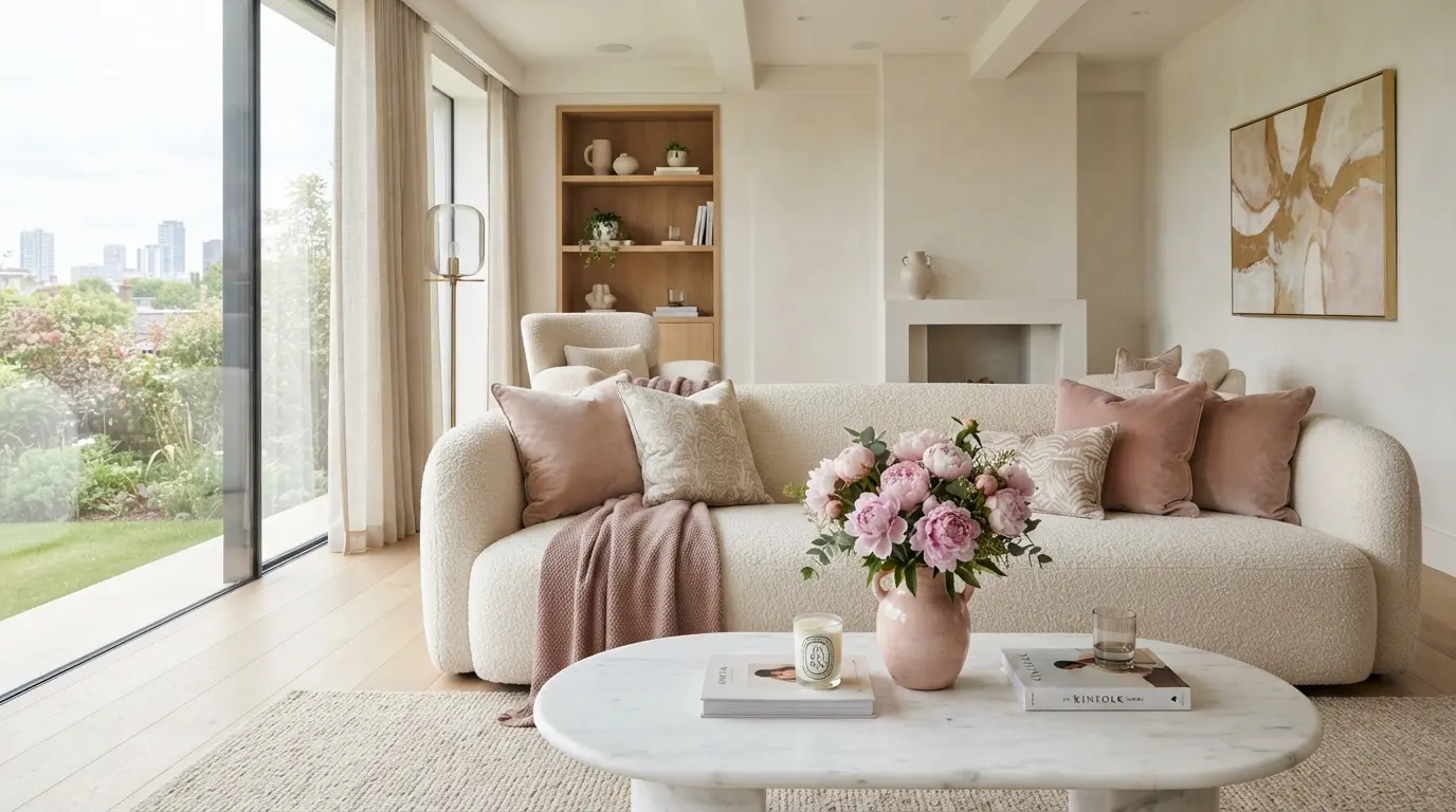
Velvet and boucle cushions in blush or dusty rose are the single fastest upgrade you can make. Mix two pink cushions with two neutrals — ivory, oatmeal, or soft grey — and add a chunky knit throw in a deeper rose for contrast. Varying textures is what keeps a pink scheme from looking flat.
Rugs and Curtains
A washed-out pink Persian-style rug grounds a room without dominating it, and faded vintage patterns hide everyday wear better than solid colors. For curtains, sheer blush linen filters light into a warm glow every evening — a small change with an outsized effect on atmosphere.
Wall Art and Decorative Mirrors
Abstract prints featuring pink brushstrokes tie the palette together at eye level. If art feels like a commitment, a round mirror with a rose gold or brushed brass frame does double duty: it bounces light around the room and adds a warm metallic accent that flatters every shade of pink.
A quick shopping checklist for the living room:
- Two blush or dusty rose cushions in velvet or boucle
- One textured throw in a deeper pink tone
- A faded pink vintage-style rug or a neutral rug with pink accents
- One piece of abstract wall art containing pink tones
- A rose gold framed mirror or picture frames
- A ceramic vase in matte pink with fresh or artificial stems
Pink Bedroom Accessories for a Calm, Layered Look
Bedrooms are where soft pinks genuinely earn their keep. Muted rose tones lower the visual temperature of a room, which is exactly what you want in a space built for rest. The goal is layers of closely related pinks rather than one loud block of color.
Here’s the layering order professional stylists use for pink bedding and bedroom accessories:
- Start with neutral base bedding — white or ivory sheets keep the scheme from feeling heavy.
- Add a blush duvet cover or quilt in washed cotton or linen for that soft, lived-in texture.
- Layer a dusty rose throw folded across the foot of the bed to deepen the palette.
- Mix cushion tones — two blush, one mauve, one cream — in different fabrics.
- Finish with warm accents — a rose gold table lamp, a pink glass carafe, or dried flowers on the nightstand.
If your bedroom furniture is dark, lean toward dusty and mauve pinks. If it’s light oak or white, blush and ballet pinks will look fresher. Feminine home decor doesn’t have to mean frilly — clean-lined pink accessories against simple furniture reads modern, not sugary.
Pink in the Kitchen and Dining Room
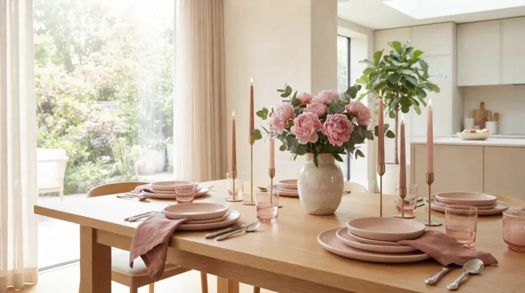
Pink kitchens sound bold, but pink kitchen accessories are surprisingly easy to pull off because they appear in small doses. A stand mixer in pastel pink, a set of blush stoneware plates, or salmon linen napkins bring color into a space that’s usually dominated by hard, neutral surfaces.
For the dining table, think in vignettes. A pink table runner, a low ceramic vase with peonies or dried grasses, and a pair of taper candles in rose tones create a finished look in under five minutes. Pastel pink decor works especially well against wood dining tables, where the warmth of the timber keeps the pink grounded.
A few kitchen and dining ideas worth stealing:
- Blush stoneware or ceramic dinnerware mixed with plain white pieces
- Pink glass tumblers or ribbed drinkware for everyday color
- Salmon or dusty rose linen napkins and a matching runner
- A pastel pink kettle, toaster, or stand mixer as a single appliance accent
- Open-shelf styling with one or two pink ceramic pieces among neutrals
Bathroom Accessories in Pink Tones
Bathrooms are small, which makes them perfect testing grounds. Swap in blush towels, a dusty pink bath mat, and a rose gold soap dispenser and the whole room changes character for the price of a dinner out.
Marble and pink is a combination that always looks intentional — a pink marble tray corralling perfumes or skincare instantly reads as luxury pink home styling. Add a eucalyptus stem in a small pink glass vase and the space feels like a boutique hotel rather than a family bathroom.
Vases, Candles, and Table Decor: The Finishing Layer
Decorative objects are where pink home decor accessories do their most subtle work. A trio of matte pink vases in staggered heights, a scented candle in a rose-tinted glass jar, and a small sculptural bowl can restyle a console table or bookshelf completely.
Artificial flowers have improved dramatically, and the right faux stems are indistinguishable from fresh at arm’s length. Pair silk peonies or ranunculus in pink tones with real eucalyptus or dried pampas grass — the mix of faux color and real texture is the trick stylists use to keep arrangements believable.
When grouping objects, follow the rule of three: vary the height, vary the texture, and keep one item non-pink. That single neutral or green piece stops the vignette from looking like a themed display.
Rose Gold and Pink: The Pairing That Never Misses
Rose gold home accessories are essentially pink’s metallic cousin, which is why the two blend so seamlessly. Rose gold picture frames, candle holders, cabinet handles, and lamp bases add shine to a pink scheme without introducing a competing color.
The one caution: keep metallics to a single finish per room where possible. Rose gold next to chrome tends to clash, while rose gold with warm brass can coexist because both sit on the warm end of the spectrum. If your room already has black metal accents, that contrast actually sharpens pink beautifully.
Modern vs Vintage Pink Interiors: Two Very Different Moods
Pink swings between two personalities depending on how you style it. Contemporary pink decor is matte, muted, and minimal — think dusty rose against concrete, linen, and pale wood. Vintage pink leans romantic: florals, fringed lampshades, scalloped edges, and rich rose tones against dark timber.
Neither is better, but mixing the two carelessly is where rooms go wrong. Pick a lane for each room, then borrow one or two pieces from the other side as accents.
| Element | Modern Pink Style | Classic / Vintage Pink Style |
|---|---|---|
| Dominant shades | Dusty rose, blush, muted mauve | Rose, salmon, antique pink |
| Textures | Boucle, matte ceramic, linen | Velvet, fringe, floral cotton, lace |
| Furniture pairing | Pale oak, black metal, concrete | Dark walnut, cane, curved silhouettes |
| Wall art | Abstract prints, line art | Botanical prints, gilt-framed art |
| Metal accents | Brushed brass, matte black | Antique gold, aged bronze |
| Overall mood | Calm, airy, understated | Romantic, layered, nostalgic |
Decorating with Pink on Any Budget
One of pink’s biggest advantages is that it looks good at every price point — a $12 blush cushion cover and a $200 velvet one both do the same visual job from across the room. The smart move is to spend where texture matters and save where color alone carries the piece.
Spend on the items you touch daily: throws, rugs, and bedding, where fabric quality is felt immediately. Save on decorative objects, candles, faux flowers, and cushion covers, where budget versions are nearly indistinguishable from designer ones.
| Accessory | Budget-Friendly Option | Luxury Option | Where It Shows |
|---|---|---|---|
| Cushions | Cotton covers, high-street stores | Velvet or boucle, feather inserts | Texture up close |
| Throws | Acrylic knit blends | Wool, cashmere, or mohair | Drape and feel |
| Vases | Matte ceramic, mass-market | Handmade studio pottery, Murano glass | Shape and finish |
| Rugs | Machine-woven, washed pink print | Hand-knotted wool, vintage Persian | Underfoot and longevity |
| Candles | Rose-tinted jar candles | Designer scented candles | Scent quality |
| Wall decor | Printable art, simple frames | Original art, artisan mirrors | Focal impact |
Seasonal Styling with Pink Accessories
Pink adapts to the calendar better than most accent colors, which makes it a genuinely year-round investment. In spring, pair blush accessories with fresh tulips, light linens, and plenty of white. Summer suits brighter salmon and coral-pink tones alongside rattan and glass.
Come autumn, shift toward terracotta-pink and mauve with olive greens and warm woods. In winter, deep rose velvet cushions, a heavier knit throw, and rose gold candlelight make pink feel cozy rather than pastel. Rotating just three or four pieces per season keeps the room current without a full restyle.
Expert Styling Tips from the Design World
- Follow the 60-30-10 rule. Keep pink at the 10 percent accent level in shared rooms, or push it to 30 percent in bedrooms where softness is welcome.
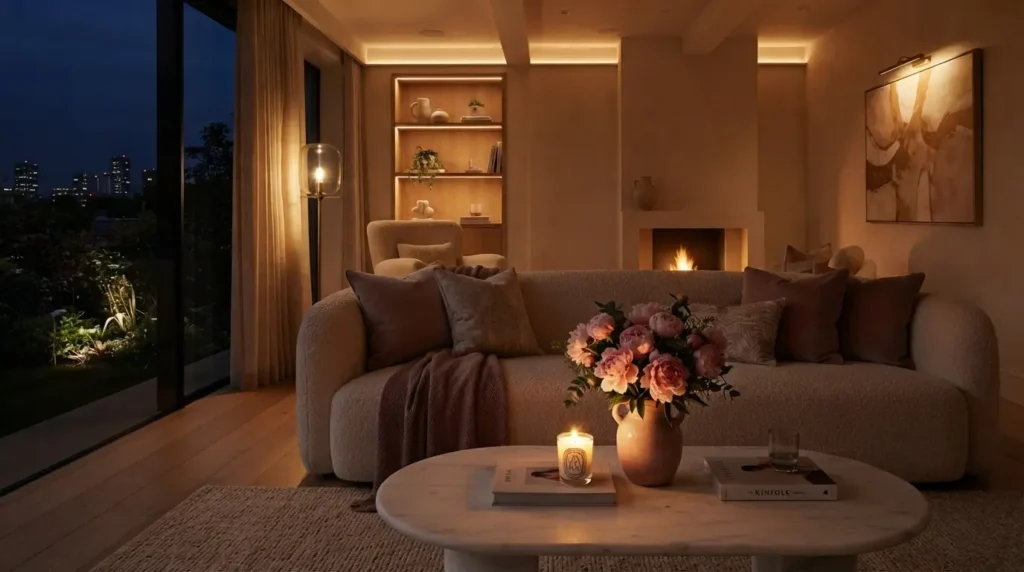
- Test in your actual light. Pink shifts dramatically between daylight and warm bulbs — a blush cushion can look beige at noon and peach at night. Check swatches in the room before buying big pieces.
- Anchor pink with something earthy. Wood, rattan, terracotta, or greenery stops a pink scheme from floating into candy-shop territory.
- Repeat the shade at least twice. A single pink item looks accidental; the same tone appearing in a cushion and a vase looks designed.
- Use greenery as a contrast valve. Olive, sage, and eucalyptus tones are pink’s most reliable partners and instantly make the palette feel organic.
Common Pink Decorating Mistakes to Avoid
Most pink-gone-wrong rooms fail for predictable reasons. Watch for these:
- Choosing one flat shade everywhere. A room in a single uniform pink looks like a paint swatch. Layer at least two or three related tones.
- Ignoring undertones. Mixing warm salmon with cool magenta creates visual tension that’s hard to pinpoint but easy to feel.
- Skipping texture. Pink relies on velvet, boucle, linen, and ceramic contrast more than most colors. Smooth-everything schemes fall flat.
- Going all-in overnight. Buy three pieces, live with them for two weeks, then decide whether the room wants more.
- Forgetting the grown-up anchors. Black metal, walnut wood, or charcoal grey keep pink sophisticated. Without them, rooms drift toward playroom energy.
Final Thoughts
The beauty of home accessories pink styling is how low the barrier to entry is. Two cushions and a vase are enough to test whether the color belongs in your home — and if it does, the layering options run from a five-dollar candle to a hand-knotted rug.Start with one room, choose one shade family, and anchor it with wood, greenery, or a dark accent. Repeat the tone a couple of times, mix your textures, and resist the urge to buy everything at once. Do that, and pink stops being a trend you’re trying and becomes a palette that quietly makes every room feel warmer.
Frequently Asked Questions
What colors go best with pink home accessories?
Cream, warm white, and oatmeal are the safest partners because they let pink stay soft. For contrast, sage green, olive, and eucalyptus tones balance pink beautifully, while charcoal grey and black metal accents make it feel modern. Rose gold and brass are the most flattering metallics to pair with any shade of pink.
How do I use pink in home decor without it looking childish?
Stick to muted shades like blush, dusty rose, and mauve rather than bright bubblegum tones. Anchor the pink with grown-up materials — walnut wood, black metal, marble, or linen — and repeat each shade at least twice around the room. Limiting pink to about 15 to 20 percent of the visible space keeps it sophisticated.
Which rooms suit pink home decor accessories the most?
Bedrooms and living rooms benefit most because soft pinks create the calm, warm atmosphere those spaces need. Bathrooms are excellent low-risk testing grounds since towels and small accessories are inexpensive to swap. Kitchens and dining rooms work well with small doses — think blush stoneware, pink glassware, and linen napkins rather than large fixed elements.
Is pink home decor still in style for 2026?
Yes, muted pinks have shifted from trend to staple, with designers treating dusty rose and blush as warm neutrals rather than statement colors. The 2026 direction favors earthy, grey-toned pinks paired with natural textures like boucle, rattan, and unglazed ceramics. Because these shades integrate with neutral schemes, they age far better than the brighter pinks of past trend cycles.