Travel-Inspired Home Decor Ideas for Every Room | AestheticWhirl
Travel-Inspired Home Decor Ideas: A Practical Room-by-Room Guide
A travel-inspired home is not a museum of everything you have ever brought back in a suitcase. The rooms that carry this look well tend to show less, not more: a quiet backdrop, a few honest materials, and a handful of objects that each have a reason to be there.
The approach is simple to describe. Start with a neutral foundation on the walls, floors and large furniture. Add two or three natural materials — wood, linen, jute, stone, clay – so the room has texture without visual noise. Then give each space one or two meaningful pieces: a woven textile from a market, a hand-thrown bowl, a framed map of a city that mattered to you.
What makes it work is restraint. A collected room looks like it came together over years, even if it was arranged last weekend. That comes from editing what goes on display, repeating colors and materials so pieces relate to each other, and leaving enough empty space for the good things to be seen.
None of this depends on a large budget or new furniture. Most of the difference comes from measuring properly, choosing a palette, and deciding which pieces deserve the space.
What Makes a Room Feel Collected, Not Cluttered
Two rooms can hold the same number of objects and feel completely different. The difference is rarely the objects themselves; it is how they relate to the room and to each other.
- A neutral base. Walls, floors and large furniture in warm, quiet tones let smaller pieces stand out instead of competing with the backdrop.
- Two or three dominant materials. A room built on oak, linen and terracotta reads as calm. Add five or six more finishes and it starts to read as busy, even if every piece is beautiful.
- One or two focal objects. Each room benefits from a clear first place for the eye to land — a large textile, a framed print, a sculptural lamp. Too many focal points cancel each other out.
- Repetition. When a color or material appears in two or three places around a room, the pieces start to look related. A rust cushion, a rust-toned print and a terracotta pot connect the room more than any single statement piece can.
- Negative space. Empty wall, a clear stretch of shelf, a bare corner of a table. These gaps are what make the objects around them look chosen.
- Intentional placement. Objects placed at different heights, grouped with purpose and given some distance from the next group look curated. Objects spread evenly across every surface look stored.
Start With a Calm Color Base
A useful starting point is the 60-30-10 approach: roughly 60% of the room in a dominant neutral, 30% in a secondary color or material, and 10% in accent colors. Treat it as a flexible guideline for balance, not a rule to measure with a tape. Its real value is reminding you that accents only work when they are a small share of the room.
| Share | Where it usually goes | Example palette |
|---|---|---|
| About 60% — dominant neutral | Walls, large rug, sofa, bed linen | Warm white, oat, sand, soft greige |
| About 30% — secondary tone | Curtains, accent chair, throws, wood furniture | Muted olive, clay, warm walnut, dusty blue |
| About 10% — accent | Cushions, ceramics, artwork, one textile | Rust, deep green, indigo, ochre |
Travel finds often bring strong color with them: an indigo-dyed cloth, painted tiles, a bright woven basket. Let those pieces supply the 10%, and choose the 60% and 30% so they support rather than fight them. Warm neutrals tend to suit earthy, handmade objects; cool grey and stark white can make them look out of place.
If a room already feels busy but you cannot say why, look at how much accent color has crept in. Pulling it back to a handful of pieces is often the quickest fix.
Choose Two or Three Natural Materials
Natural materials do much of the work in a collected room. They bring texture and warmth, they age well, and they sit comfortably beside objects from many different places.
- Wood — the usual anchor. Oak, walnut, teak and reclaimed timber all work; try to keep larger pieces in one or two related tones.
- Linen and cotton — relaxed, slightly textured fabrics for curtains, bedding and cushion covers. Washed linen in particular softens a room without adding pattern.
- Jute, sisal and seagrass — hard-wearing natural rugs with a strong, coarse texture. Jute is softer underfoot; sisal is tougher in busy areas.
- Rattan and wicker — lighter, airy texture for chairs, baskets and lampshades. Keep them out of steamy bathrooms and direct, constant sun, where they can soften, dry out or discolor.
- Stone and terracotta — weight and coolness for side tables, trays and planters.
- Ceramic — the natural home for many travel finds: bowls, vases, tiles and cups.
- Metal — aged brass, bronze or blackened iron in small amounts. Lots of polished chrome tends to work against the look.
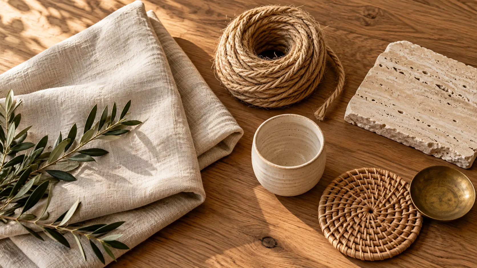
A reliable formula is one primary material (usually wood), one secondary (linen or rattan), and one accent (stone, ceramic or brass). Texture creates depth here, so the contrast between a rough jute rug, a smooth wooden table and a nubby linen sofa adds interest without adding objects.
Texture pairings that work well:
- A chunky knit throw on a linen sofa, with a jute rug underneath.
- A smooth ceramic lamp base on a rough-sawn wooden side table.
- Linen cushion covers with one velvet cushion for contrast.
- A rattan pendant above a stone or concrete-look table.
How Travel-Inspired Decor Compares With Japandi, Boho and Coastal Style
Travel-inspired decor is better thought of as an approach than a fixed style. It borrows the calm backdrop of minimal styles and the personal objects of more layered ones, and it adapts to whatever architecture and climate you live in.
| Style | Color base | Pattern and objects | How travel-inspired decor differs |
|---|---|---|---|
| Japandi | Muted neutrals, black accents | Very low; function first | Keeps the calm base but allows more personal objects with a story |
| Boho | Warm, often saturated, layered rugs | High; visible abundance | Uses similar handmade pieces but edits them much more strictly |
| Coastal | Blue, white, sand | Low; nautical motifs | Shares the natural textures without the seaside color scheme |
If your home already leans toward one of these, the two blend easily. A pared-back Japandi-style room can take one or two travel pieces per space without losing its calm; a boho room usually needs some editing before the collected look comes through.
Living Room Ideas
The living room usually holds the most objects and the most furniture, so it is where the balance between personality and calm matters most.
Size the rug to the furniture, not the floor. A rug that is too small is one of the most common reasons a living room looks unfinished. As a practical guideline, choose a rug large enough for at least the front legs of the sofa and chairs to rest on it. In a living room of roughly 12 × 15 ft, an 8 × 10 ft rug usually does this, while leaving a border of bare floor around the edges. Flat-woven jute or wool suits this look better than high-pile synthetics.
Give furniture room to breathe. A few practical spacing guidelines:
- Leave about 14–18 in between the sofa and the coffee table — close enough to reach a cup, far enough to walk past.
- Keep main walkways around 30–36 in wide where the room allows.
- Pull the sofa a few inches off the wall if space permits; even a small gap makes the room feel less crowded.
- Arrange seating so people can talk without raising their voices; in most rooms that means seats within about 8–10 ft of each other.
Light the room in layers. One ceiling fixture flattens texture and makes natural materials look dull. Aim for light at three levels: a floor lamp beside a reading chair, a table lamp on a side table or console, and something low, such as a small lamp on a shelf. Warm-white bulbs, typically labeled around 2700K–3000K, bring out the warmth of wood, linen and terracotta.
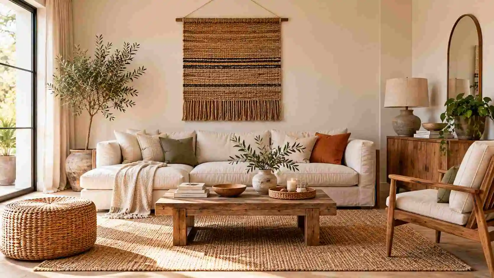
Choose one focal piece. This might be a large woven hanging above the sofa, a framed vintage map, or a sculptural floor lamp. Hang art so its center sits roughly at eye level, a common guideline is around 57–60 in from the floor, and keep the bottom edge a few inches above the sofa back so the two read as one group.
Style books and travel finds together. Mix horizontal stacks of books with upright rows, and use a stack as a low plinth for a small object. Leave some sections of each shelf empty. A bookcase where roughly a third of the space is open tends to look calmer than one filled edge to edge.
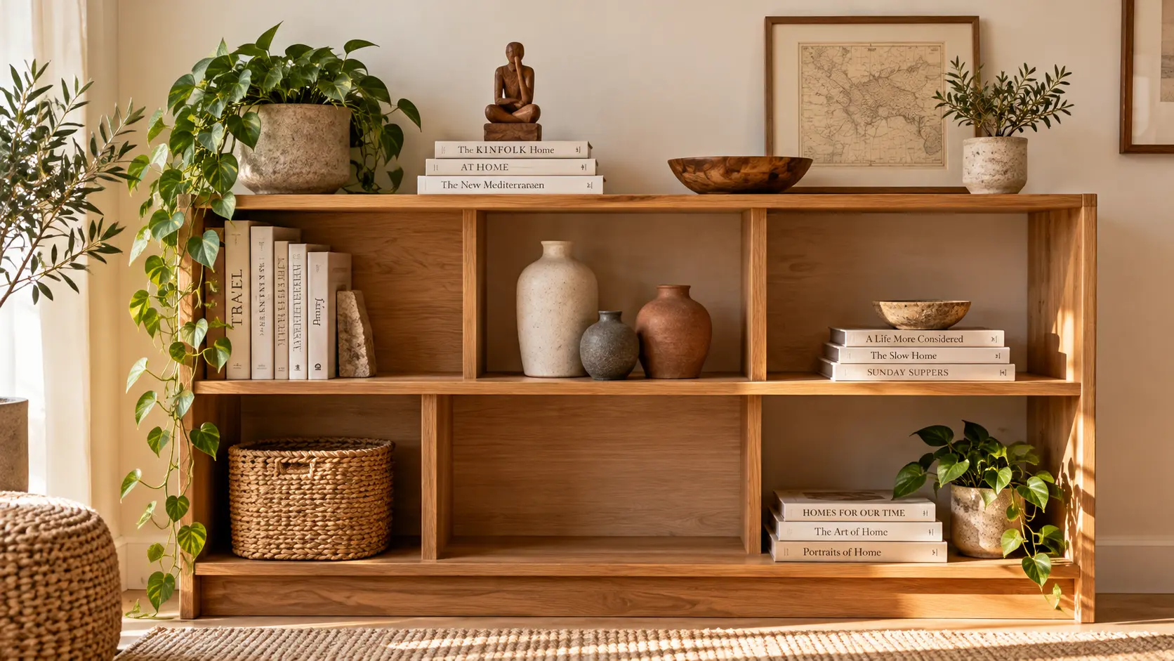
Keep the coffee table simple. A tray, a short stack of books and one object with height, such as a vase or a carved wooden piece, is enough. A tray also gives remotes and keys a home so they stop drifting across the surface.
For cushions and throws, keep most pieces in the room’s neutral and secondary tones and let one or two carry the accent. Our guide to choosing decorative throw pillows for a living room covers sizes and combinations in more detail.
Bedroom Ideas
A bedroom works best with fewer objects than any other room. It is the place where visual quiet is worth the most.
Layer bedding simply. A fitted sheet, a washed linen or cotton duvet cover in a neutral, and one textured throw folded across the lower third of the bed is plenty. Two sleeping pillows plus one or two decorative cushions looks finished without turning bedtime into an unpacking job.
Use storage as part of the design. Closed bedside tables with a drawer, baskets under a bench, and a bed with built-in drawers keep everyday clutter out of sight, which is what makes the remaining objects look deliberate. Choose a bedside table roughly level with the top of the mattress so lamps and books are easy to reach.
Mount lighting where it helps. Wall sconces or plug-in wall lights free the bedside table for a book and a glass of water. As a rough guide, position them so the light falls on a book when you sit up in bed — often somewhere between 20 and 30 in above the mattress, depending on the headboard and your height.
Edit the wall above the bed. Instead of one very large artwork, consider a narrow picture ledge holding two or three framed pieces. You can rotate travel photos or prints without adding new holes to the wall each time.
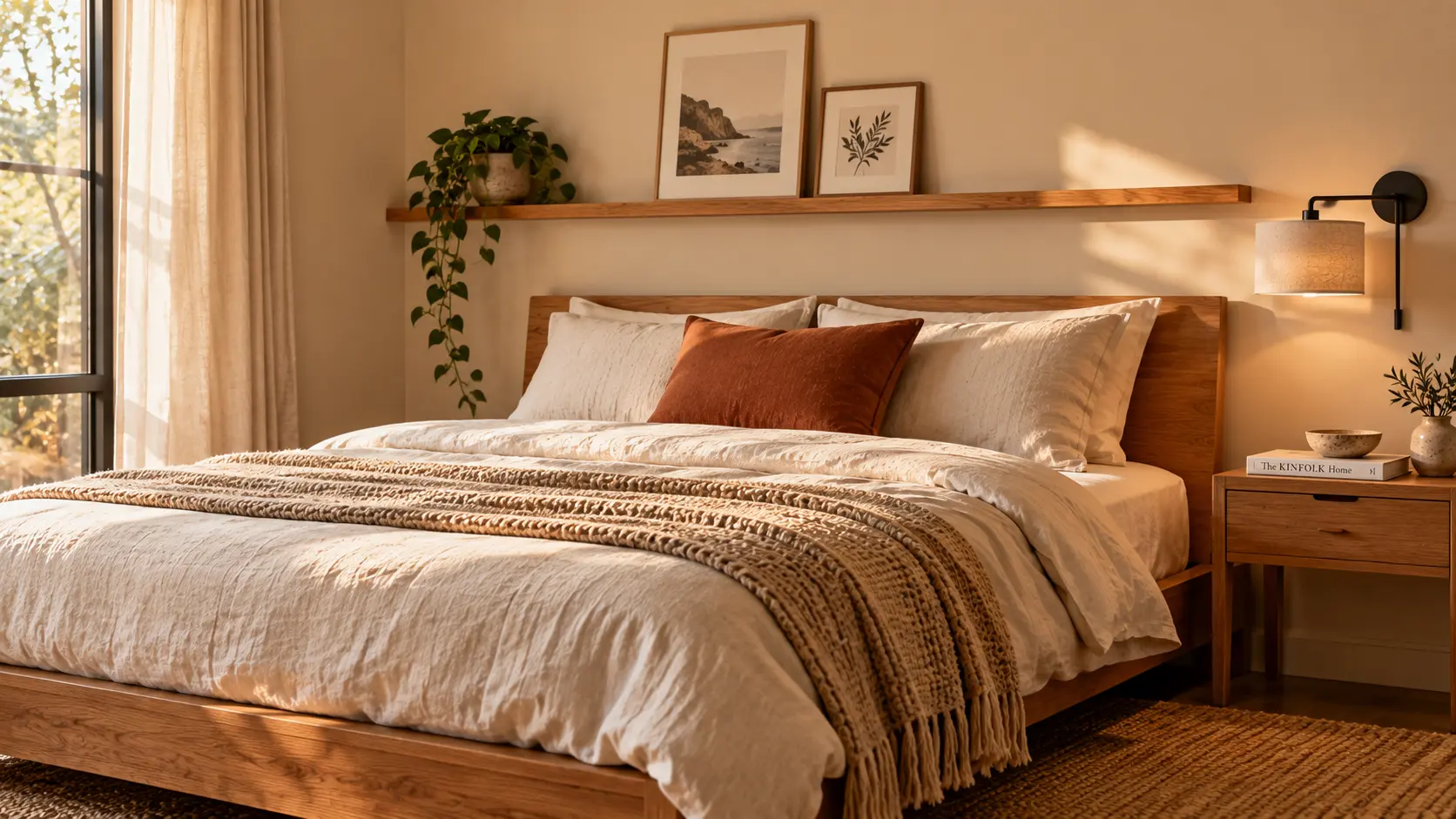
Keep surfaces calm. One meaningful object per surface is a good starting rule: a small carved box on a dresser, a ceramic dish on the bedside table. Everything else goes in a drawer.
Kitchen and Dining Ideas
Kitchens fill up with practical clutter quickly, so the collected look here depends on choosing a small, intentional display and keeping the rest clear.
Create one counter vignette. Lean a wooden cutting board against the backsplash, stand a ceramic crock of utensils beside it, and add a small stone or wooden riser for oil and salt. Keep the rest of the counter clear. One deliberate grouping looks styled; several start to look like storage.
Put ceramics to work. Handmade bowls, plates and cups collected over time can live on an open shelf or in a glass-front cabinet. Stack plates, group cups by color, and leave gaps between groups.
Update hardware before cabinets. Swapping cabinet handles in brass, bronze or matte black changes how a kitchen reads for a small cost. Measure the center-to-center distance between existing screw holes first; common sizes include 3 in, 3¾ in (96 mm) and 5 in (128 mm). Matching the existing spacing avoids filling and redrilling.
Hang the dining light at a practical height. A pendant or chandelier above the dining table gives the room a center. A widely used guideline is to hang the bottom of the fixture about 30–36 in above the tabletop in a room with a standard 8 ft ceiling, and to choose a fixture roughly half to two-thirds the width of the table. Rattan, paper or ceramic shades suit this look.
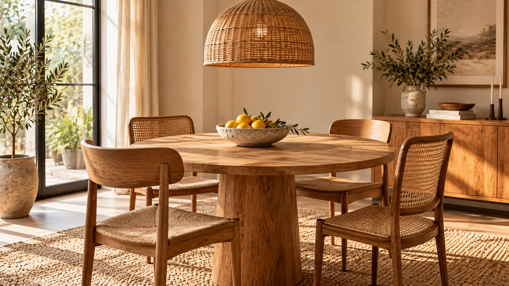
Keep the table centerpiece low and seasonal. A bowl of citrus in summer, a few dried branches and candles in autumn, fresh flowers in spring. Keep it low enough that people can see each other across the table.
Mix seating materials carefully. A round wooden table with chairs in two complementary materials, such as wood and cane, tends to look collected rather than matched.
Bathroom Ideas
Bathrooms are small, humid and full of everyday products, so a few careful swaps have a visible effect.
- Decant into simple dispensers. Glass or ceramic soap and lotion dispensers look calmer than a row of printed plastic bottles.
- Roll towels on open shelves. Rolled towels in one or two colors look neat and are easy to grab. Keep patterned towels for the hook.
- Use materials that tolerate moisture. Stone, glazed ceramic, glass and sealed or teak wood handle steam well. Keep rattan, jute and paper away from the shower area.
- Add one plant suited to the room’s light. A pothos or a fern can cope with humidity if there is some natural light; a windowless bathroom is better served by a good-quality artificial stem.
- Limit small objects. One tray holding a dish, a candle and a small travel find is enough. More than that makes cleaning harder and the room busier.
Entryway and Small-Space Ideas
In small spaces, every object and piece of furniture takes up a larger share of the view, so solve function first and add personality second.
Measure before buying anything. Note the width of the space, the swing of the door and the walkway you need to keep. As a guideline, try to keep about 36 in of clear path through an entry or hallway, and choose a narrow console, around 10–14 in deep, where space is tight.
Start with hooks and a drop zone. A rail of hooks at roughly 60–66 in from the floor for adults (lower for children), a narrow console or wall shelf, and one tray or bowl for keys deal with most entryway clutter.
Use a mirror to bounce light. A mirror placed near or across from a window reflects light deeper into the space and makes a small entry feel more open.
Add baskets low and art small. A woven basket under the console holds shoes or bags. Above it, one small framed print or a textile fragment adds personality without crowding the wall.
Go vertical in small apartments. Tall, narrow shelving, a storage ottoman that doubles as a coffee table and a bench at the foot of the bed add storage without using more floor. Choose furniture with visible legs where possible; seeing floor beneath a piece makes a small room feel larger.
How to Display Travel Finds Without Creating Clutter
Collecting and displaying are two different things. Most well-styled homes show only part of what their owners have gathered; the rest is stored, rotated or framed. These methods help the pieces you do show look intentional.
Group related objects. Small items look scattered on their own and stronger together. Group by a shared quality: color, material, shape or origin. Three small clay pots in different sizes read as one display; three pots on three different shelves read as clutter.
Use odd numbers and varied heights. Groups of three or five tend to look more natural than pairs. Within a group, combine one tall piece, one medium and one low, and let them overlap slightly so they read as a unit rather than a row.
Give each area one meaningful object. On a console, a windowsill or a bedside table, choose one piece with a story and let it stand alone with space around it. One carved bowl on an empty surface gets far more attention than the same bowl among ten other things.
Repeat colors and materials. If a room has a terracotta vase, repeat that warm tone in a cushion or a print elsewhere. Repetition ties objects from different places into a single room.
Rotate instead of adding. Keep one shelf or ledge as a rotating display and store the rest in a lined box or drawer. Change it with the seasons or after a new trip. Pieces stay interesting, and nothing gathers dust for years.
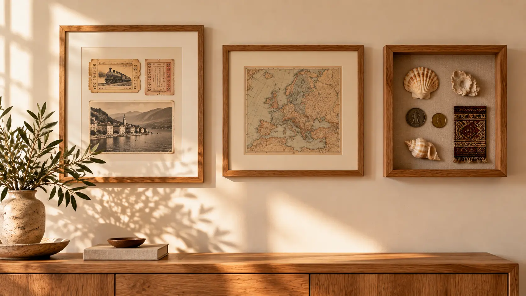
Frame flat keepsakes. Tickets, postcards, stamps, receipts, pressed flowers and small maps look far better framed than pinned. A single large frame with a wide mat around a few small items looks more considered than many tiny frames. Keep the frames consistent in color and material so a mixed set of keepsakes still reads as one collection.
Use shadow boxes for three-dimensional pieces. Shells, coins, small textiles, keys and ceramic fragments can be mounted in a deep frame. This protects them from dust and handling and turns a loose handful of objects into one wall piece.
Hang textiles as art. A woven cloth, a scarf or a small rug can be mounted on a wooden hanging rod or stitched to a fabric-covered board. Keep valuable or fragile textiles out of direct sun, which can fade natural dyes over time.
Protect paper and photographs. Use acid-free mats and, for pieces in bright rooms, glazing with UV protection. Avoid hanging original paper items on walls that get strong direct sunlight.
Leave negative space. Empty wall and open shelf space are part of the display. If every surface holds an object, none of them stands out.
When buying souvenirs with display in mind, handmade pieces from local makers usually carry more meaning and age better than mass-produced “global-style” decor. Some natural items, such as untreated wood, seeds, shells and plant materials, can be restricted by customs rules, so check before bringing them home.
Use Plants to Add Life Without Overcrowding
Plants soften the hard lines of furniture and add a living texture beside wood and stone. They work best when chosen for the room’s actual light and used in small numbers.
| Light in the room | Typical places | Plants that usually cope well |
|---|---|---|
| Low, indirect | Hallways, north-facing rooms | Snake plant, ZZ plant, cast-iron plant |
| Medium, indirect | Living room shelves, desks set back from windows | Pothos, philodendron, spider plant |
| Bright, direct | South- or west-facing windowsills | Jade plant, aloe, small succulents |
A few styling guidelines:
- Think in scale. One larger floor plant often looks better than five small pots. Use it to fill an empty corner or balance a tall bookcase.
- Group small plants. Put two or three small pots together on one tray or plant stand rather than spreading them across several surfaces.
- Choose containers that match the materials. Terracotta, glazed ceramic, stone or woven baskets with a liner suit this look. Keep containers in two or three finishes.
- Stop before the room feels like a greenhouse. Two to four plants is enough for most living rooms unless the space is very large.
If you have pets, check a plant’s safety before buying. Several common houseplants, including pothos and snake plant, are listed as toxic to cats and dogs by the ASPCA’s toxic and non-toxic plants database.
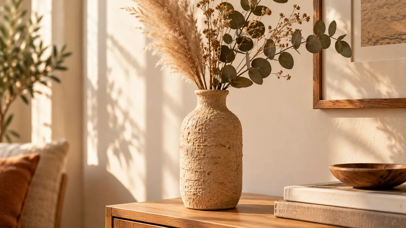
Where live plants struggle, a heavy ceramic jug with dried or faux branches, such as eucalyptus or olive, gives similar organic texture with no upkeep.
Two Simple Weekend DIY Projects
Both projects use inexpensive materials and need no special tools. Costs are approximate US retail prices as of late 2026 and vary by store and region; if you already have leftover paint, the cost drops further.
Project 1: Stone-Effect Decorative Vase
A plain glass jar or bottle becomes a textured, earthy vase that suits shelves and side tables. It is decorative only; the coating is not waterproof, so use dried stems or put a small glass inside for fresh flowers.
Materials: a clean glass jar or bottle; about one cup of matte latex or chalk-style paint in a warm neutral; one to two tablespoons of baking soda; a small, stiff paintbrush; optional fine sandpaper.
Approximate cost: $5–$15 (often less with leftover paint).
Approximate time: 2–3 hours, mostly drying time.
- Wash and dry the jar, then remove any labels and glue.
- Mix the paint with one tablespoon of baking soda. Add more baking soda gradually for a coarser, grittier texture.
- Brush the mixture on in short, crisscross strokes. Uneven coverage looks more like stone than a smooth coat.
- Let it dry for about 45–60 minutes, then add a second coat for more texture.
- Once fully dry, lightly sand raised areas if you want a weathered, worn finish.
Project 2: Textured Canvas Wall Art
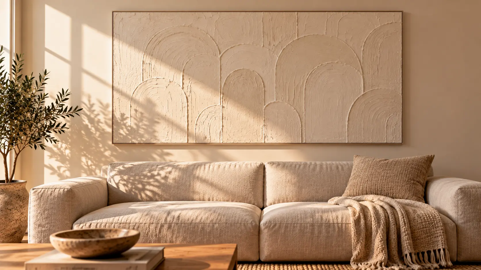
A stretched canvas covered in plaster-like texture adds dimension to a large empty wall, especially above a sofa or bed.
Materials: a stretched canvas (24 × 36 in works above most sofas); a tub of lightweight spackle or joint compound; a putty knife or old plastic card; matte paint in warm white, oat or clay; a wide brush; a drop cloth.
Approximate cost: $30–$60, depending mostly on canvas size.
Approximate time: about 1–2 hours of work, plus around 24 hours of drying.
- Lay the canvas flat on a drop cloth.
- Spread spackle across the surface with the putty knife, roughly 2–5 mm thick.
- Shape the texture: soft arches, horizontal sweeps or simple overlapping shapes. Keep the pattern loose; perfection is not the goal.
- Let it dry fully, usually overnight. Thick areas may need longer.
- Paint the whole surface in one warm neutral. Light catching the raised texture provides the interest, so color can stay quiet.
What Travel-Inspired Decor Costs
This look relies more on editing and arrangement than on spending. The table below gives rough ranges to help with planning. Prices are approximate US retail ranges as of late 2026; they vary widely by brand, size, quality and region, and secondhand pieces can cost far less.
| Item or project | Approximate cost (USD) | Time | Visual impact |
|---|---|---|---|
| Rearranging and editing a room | Free | 2–4 hours | High |
| Stone-effect vase DIY | $5–$15 | 2–3 hours | Medium |
| Warm-white bulbs for one room | $10–$40 | Under 1 hour | Medium–high |
| Cabinet hardware swap (small kitchen) | $40–$150 | 1–3 hours | Medium |
| Textured canvas DIY | $30–$60 | 1 day incl. drying | High |
| Framing tickets, maps or postcards | $20–$80 per frame | 1 hour | Medium |
| Shadow box for small objects | $15–$50 | 1 hour | Medium |
| Linen cushion covers (set of two) | $25–$80 | — | Medium |
| 8 × 10 ft jute or flat-weave rug | $150–$450 | 1 hour | Very high |
| Plug-in wall lights (pair) | $50–$150 | 1 hour | High |
If you are working with a tight budget, start with the free and low-cost items: edit, rearrange, change the bulbs and frame what you already own. Our economy home decor tips cover more low-cost ideas, and secondhand stores are a good source of solid wood frames, ceramics and linen, which often look better slightly worn.
Common Mistakes That Make Collected Decor Look Cluttered
The same few mistakes account for most rooms that tip from collected into crowded.
| Mistake | Why it happens | What to do instead |
|---|---|---|
| Too many small objects | Each piece seems too small to matter on its own | Group small pieces on a tray or in a shadow box, or store them |
| Too many colors | Every souvenir brings its own palette | Keep accents to about 10% of the room and repeat one or two accent colors |
| No visual repetition | Objects come from many places and never relate | Repeat a color, material or shape at least two or three times across the room |
| Oversized furniture | Pieces bought without measuring | Measure the room and walkways first; tape the footprint on the floor before buying |
| Every souvenir on display at once | It feels wrong to put meaningful things away | Rotate one shelf seasonally; frame or box the rest |
| Competing focal points | Several large statement pieces in one room | Choose one focal piece per room and let the rest support it |
| Ignoring scale | Small art on a large wall, a tiny rug under a large sofa | Size art and rugs to the furniture they sit with |
| Filling every surface | Empty space feels unfinished | Leave some surfaces and wall areas deliberately bare |
A Simple Weekend Plan to Refresh One Room
One room over one weekend is a realistic scope. The aim is a calmer, more personal room, not a full makeover.
Friday evening — clear and plan
- Remove everything from the surfaces and shelves into a box or onto a bed.
- Choose your palette: one dominant neutral, one secondary tone, one or two accents.
- Measure the room, the main walkways and any wall you plan to hang art on.
Saturday — arrange and layer
- Rearrange the main furniture first, using the spacing guidelines above.
- Lay the rug, then add textiles in your chosen materials: throws, cushions, curtains.
- Add or move lamps so light comes from at least two or three heights, and switch to warm-white bulbs.
Sunday — add meaning and edit
- Bring back only the objects that suit the palette and have a reason to be there. Start with one focal piece, then one meaningful object per surface.
- Photograph the room from the doorway. Photos make clutter easier to spot than standing in the room.
- Take out anything that does not earn its place, and store it for the next rotation.
Live with the result for a week or two before buying anything new. Gaps that still feel wrong after that are the ones worth filling. For more ideas on reworking a single space, see our aesthetic room makeover ideas.
FAQs
How can I decorate with travel souvenirs without making my home look cluttered?
Show fewer pieces at once and give each one space. Group small items by color or material on a tray or shelf, frame flat keepsakes such as tickets and maps, and use shadow boxes for small three-dimensional objects. Keep one shelf as a rotating display and store the rest, so nothing has to compete for attention.
What colors work best for travel-inspired home decor?
Warm neutrals such as warm white, oat, sand and soft greige make a reliable base, because they suit wood, linen and handmade ceramics. Secondary tones like muted olive, clay or dusty blue add depth. Let the strongest colors come from the souvenirs themselves, and keep them to roughly a tenth of the room. If you prefer a darker, moodier version of a calm palette, our guide to dark Japandi style shows how deep tones can stay restful.
How many decorative objects should I display in one room?
There is no fixed number, but a practical starting point is one focal piece per room, one meaningful object per surface, and small items grouped in threes or fives. If every surface holds something, remove about a third of the objects and see whether the room feels calmer.
Can travel-inspired decor work in a small apartment?
Yes, and it often works especially well, because a small space rewards editing. Keep the base light and neutral, use vertical shelving and wall-mounted lights to free up surfaces, and limit display to one or two areas, such as a single shelf and one wall. Framed keepsakes and wall-hung textiles add personality without taking floor space.