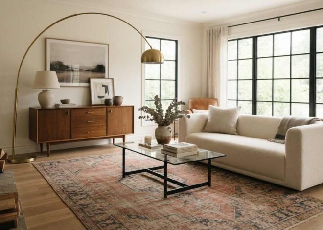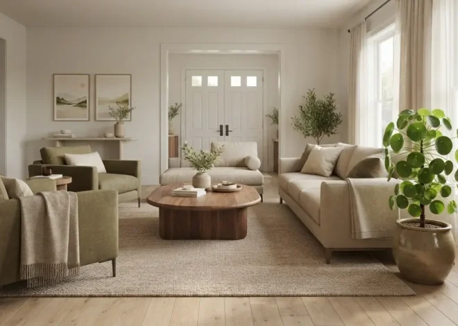
How Do You Find Your Home Decor Style?
I hear the same sentence in almost every first consultation: “I know what I like, I just can’t explain it.” Then out comes the phone — a limewashed Belgian kitchen, a walnut credenza on hairpin legs, a maximalist London flat with three patterns fighting happily on one wall, and a bare Japanese-inspired bedroom holding nothing but a low bed and a paper lantern. Every image is lovely. Together, they look like four different people live there.
That gap is the actual problem. Learning how to find your home decor style is not about answering ten questions and receiving a label. It is about learning to read your own preferences the way a designer reads them — as patterns in colour, material, line and proportion rather than as a shopping list of products.
Here is the encouraging part. Your taste is already consistent. Most people’s is. The consistency is simply buried under a decade of algorithmic inspiration, hand-me-down furniture, and a few purchases made in a hurry because the old sofa collapsed on a Tuesday. Once you learn to see the pattern beneath the surface, decisions stop feeling like gambles. You walk into a shop, glance at a chair, and know within three seconds whether it belongs in your home.
Over the years I have watched clients go from “I have no idea what my style is” to confidently turning down a beautiful piece because it was beautiful for someone else. That is what this guide is built to do. We will work through five practical exercises, decode the major decorating styles by their ingredients, and cover the part most articles skip entirely: what to do when you genuinely love two styles at once.
How Do You Find Your Home Decor Style?
Collect 30 to 50 interiors you love, then ignore the rooms and study the repeats — recurring colours, materials, furniture shapes and light levels. Those repeats are your style. Name it in three words, test it in one room with low-cost items, and buy only pieces that match at least two of your three words.
What a Home Decor Style Actually Means
A decorating style is not a catalogue. It is a set of decisions a room makes consistently: how much colour it carries, how heavy its furniture looks, whether its lines are curved or square, how much empty space it tolerates, and which materials keep reappearing.
Take farmhouse decor and Scandinavian decor. Both lean on white walls, natural wood and simple silhouettes, yet nobody confuses the two. Farmhouse carries visible age — distressed finishes, black metal, ticking stripe, a bit of clutter with sentimental value. Scandinavian strips the age out and keeps the light: pale ash and birch, cool whites, restrained pattern, very few objects on any surface. Same ingredients list, completely different quantities.
This is why a decorating style quiz can only take you so far. A quiz assigns a name. A designer assigns rules. The rules are what make a room hold together when you inevitably break them once or twice.
Style is a recipe, not a costume
When I plan a scheme, I write down four constraints before I look at a single product: a colour palette of three to five tones, two or three primary materials, a dominant furniture line (curved, rectilinear or mixed), and a target visual weight — how solid and grounded the room should feel.
Those four constraints do more work than any style label. They tell me a bouclé barrel chair belongs and a carved mahogany armchair doesn’t, without either piece being wrong in itself.
Why your instinct is more reliable than a label
Personal decorating style is remarkably stable over time. What changes is the packaging. Somebody who loved warm woods and low, horizontal furniture in 2008 still loves them now — they just called it mid-century modern then and might call it warm minimalism today. Trends rename things. Taste rarely changes its mind.
Why Finding Your Decorating Style Is Genuinely Difficult
If this felt easy, interior design inspiration wouldn’t be the most saved category on the internet. There are three specific reasons people get stuck, and each has a fix.
Your saved images were curated by an algorithm, not by you
Pinterest and Instagram optimise for the striking image, not the liveable room. A dramatic dark green library with a fireplace performs beautifully on a screen and behaves very differently in a north-facing flat with one small window. Over time your saved folder drifts toward photogenic extremes that have little to do with the light, ceiling height or square footage you actually own.
The fix is not to stop saving. It is to save with a note. One line — *”the colour”*, *”the low sofa”*, *”the way the art is hung”* — turns a mood board into evidence you can analyse.
You are confusing a trend you enjoy with a style you love
This one costs people the most money. A trend is something you enjoy looking at. A style is something you want to live inside for eight years. The test I give clients is simple: would you still want this if it stopped being fashionable tomorrow, and would you be happy to pay to repeat it in a second room?
Checkerboard floors, arched everything, mushroom lamps, sculptural travertine — all attractive, all currently everywhere. Some of them are genuinely your taste. Most are not, and buying them in fixed elements like tiling or joinery is where regret concentrates.
Your current home is a record of your budget, not your taste
Almost every room contains at least one piece nobody chose on purpose — the sofa bought in a rush, the wardrobe inherited from a relative, the coffee table that came free with something else. When you look around and feel that nothing matches, you are usually reacting to accidents, not to a flaw in your judgement.
Separate the accidental from the intentional before you conclude anything about your decorating preferences.
Five Exercises to Find Your Personal Home Decor Style
This is the practical core of the guide. Work through all five with a notebook open. Together they take an evening, and by the end you will have something far more useful than a style name: a written brief for your own home.
Exercise 1 — The Save Test
Gather 30 to 50 images you genuinely love. Pull them from Pinterest, screenshots, saved posts, magazine tears, hotel photos, anything. Fewer than 30 and the pattern won’t be visible; more than 60 and you will start second-guessing.
Now do the counterintuitive part: stop looking at the rooms. Look only for repeats, and tally them.
- Wall colour — white, off-white, warm neutral, deep saturated, wood-panelled?
- Wood tone — pale ash and birch, mid oak, warm walnut, dark stained, painted?
- Metal finish — brass, black, chrome, nickel, mixed, none visible?
- Sofa shape — low and horizontal, deep and rounded, tight-backed and tailored, skirted?
- Object density — bare surfaces, a few considered pieces, layered and full?
- Textiles — flat weave, chunky wool, linen, velvet, pattern-heavy?
- Light — bright and airy, warm and lamp-lit, moody and low?
Count honestly. In my experience three or four categories will show a clear winner appearing in over half your images. Those are not preferences — those are your rules. Write them down.
If two answers tie in a category, that is genuinely useful information too. It usually means you are drawn to contrast rather than to one extreme.
Exercise 2 — The Three-Word Test
Describe the home you want in exactly three adjectives. Not styles — feelings and qualities. *Warm, collected, calm.* *Bright, playful, layered.* *Quiet, textural, grounded.* *Rich, historic, dramatic.*
Three is deliberate. One word is too vague to guide anything, five words let you justify any purchase at all. Three forces a hierarchy.
Then apply the words as a filter. Every piece you consider must satisfy at least two of them. That gorgeous chrome-and-glass console? Check it against *warm, collected, calm*. It fails two. Put it down. This single rule has saved my clients more money than any other advice in this article.
Keep the words visible — phone wallpaper, notes app, taped inside a cupboard. Style discipline fails at the point of purchase, not at the planning stage.
Exercise 3 — The Room Audit
Stand in the room you use most and make three columns: Love, Tolerate, Would replace tomorrow. Put every significant item into one, and — this is the important bit — write *why* beside each entry.
The reasons matter far more than the objects. “Love it, it’s the right height and the wood is warm” and “Would replace it, too shiny and too tall” are the same insight expressed twice. You have just learned that you prefer low, matte, warm-toned furniture. That is a real design rule you can shop with.
Photograph the room in daylight and again at night, then look at the photos rather than the room. A camera flattens a space into composition and shows you the imbalance you have stopped noticing — the wall that carries all the visual weight, the corner with no light, the four different wood tones you had genuinely never registered.
Exercise 4 — The Colour Test
Open your wardrobe. Not because clothes and interiors are identical — they aren’t — but because your wardrobe is the one large collection you assembled with no pressure to coordinate. The colour family that dominates it is almost always the one you find restful.
Then run three checks:
- Warm or cool? Do you reach for cream, camel, terracotta, olive and rust, or for cool grey, blue, crisp white and black? Mixing is possible but one temperature should lead.
- Saturated or muted? Are your favourite images full of clear strong colour, or of dusty, greyed-off tones?
- Contrast level? Do you like a high-contrast room with dark and light in sharp opposition, or a low-contrast room where everything sits within two or three shades?
Those three answers give you a working colour palette before you have looked at a single paint chart. And do check paint samples in your own light — a north-facing room pushes colour cool and grey, a south-facing one warms and lightens it. The same white can read as chalk in one room and cream in another.
Exercise 5 — The Furniture Test
Furniture reveals style more accurately than accessories, because accessories are cheap to change and furniture is a commitment.
Look at the pieces you have chosen deliberately, and at chairs you have loved in restaurants, hotels and other people’s homes. Then answer:
- Legs — exposed and slender, turned and traditional, hidden by a skirt, or a solid plinth base?
- Lines — rectilinear and crisp, softly curved, or ornate and carved?
- Height — low and lounging, or upright and formal?
- Scale — a few large pieces, or several smaller ones?
- Finish — matte and tactile, polished, painted, or naturally aged?
If you keep choosing exposed slim legs, low seats and clean lines, you are drawn toward mid-century modern and contemporary home style. Turned legs, skirted upholstery and carved detail point to traditional or French country. Deep, low, rounded and heavy suggests contemporary organic. Weathered paint and visible joinery says farmhouse or rustic.
Furniture style is the skeleton of a room. Get it right and almost any accessory works. Get it wrong and no amount of styling rescues the space.
Popular Interior Design Styles and How to Recognise Yourself in Them
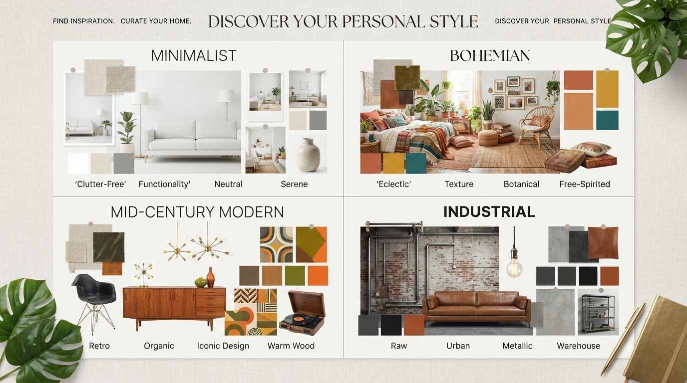
With your notes from the five exercises beside you, the labels finally become useful. Read the table below looking for the row where three or four columns describe things you already wrote down. That row is your starting point — not a life sentence, just a direction.
Table 1 — Interior Design Style Comparison
| Style | What It Looks Like | Typical Colours | Common Materials | Best Suited To |
|---|---|---|---|---|
| Modern | Clean lines, uncluttered, function-led, strong horizontals | White, grey, black, one bold accent | Steel, glass, smooth timber, leather | People who find visual noise tiring |
| Contemporary | Current and evolving, softer curves, sculptural forms | Warm neutrals, cream, taupe, charcoal | Bouclé, travertine, matte metal, oak | People who like an updated, gallery-calm home |
| Traditional | Symmetry, carved detail, formal arrangement | Deep reds, navy, forest green, gold | Mahogany, silk, brass, marble | People who value order, heritage and formality |
| Transitional | Traditional shapes, modern restraint | Soft greys, greige, cream, muted blue | Painted wood, linen, nickel, stone | People caught between classic and clean |
| Farmhouse | Practical, warm, gently worn, unfussy | White, cream, black, soft sage | Reclaimed wood, shiplap, iron, cotton | Busy family homes that must be durable |
| Cottagecore | Soft, floral, nostalgic, layered and homely | Cream, blush, sage, buttery yellow | Chintz, wicker, painted wood, ceramics | Romantics who like handmade and imperfect |
| Scandinavian | Light, airy, restrained, quietly functional | White, pale grey, blond wood, black | Ash, birch, wool, sheepskin, ceramic | Small or dark homes needing light and calm |
| Minimalist | Very few objects, generous empty space | White, stone, black, one wood tone | Concrete, plaster, oak, matte finishes | People who feel calmer with less |
| Bohemian | Layered pattern, plants, global textiles | Terracotta, rust, ochre, jewel tones | Rattan, jute, kilim, macramé, brass | Collectors and travellers who love texture |
| Industrial | Raw structure, exposed services, honest materials | Charcoal, rust, black, natural brick | Steel, concrete, reclaimed timber, leather | Lofts, warehouses and lovers of raw texture |
| Coastal | Breezy, light, relaxed, low contrast | White, sand, pale blue, driftwood grey | Linen, rattan, weathered oak, rope | People who want a holiday feeling year-round |
| Vintage | Collected over time, period pieces mixed in | Warm neutrals plus faded jewel tones | Aged brass, patinated wood, velvet, glass | Second-hand hunters who dislike matching sets |
| Eclectic | Deliberate mix held by colour discipline | Any, but a repeated palette throughout | Mixed by design, unified by tone | Confident decorators with strong personal taste |
| Mid-century modern | Low horizontals, tapered legs, warm wood | Walnut, mustard, olive, teal, cream | Walnut, teak, wool, moulded plywood | People who want warmth without ornament |
| French country | Elegant but relaxed, curved and softened | Ivory, dove grey, lavender, soft blue | Limestone, linen, oak, toile, iron | People who like refinement without stiffness |
| Dark academia | Moody, bookish, layered and enclosed | Deep green, oxblood, brown, ink | Dark wood, leather, brass, wool, books | Small dark rooms and lovers of atmosphere |
Reading the colour clues
Colour is usually the fastest diagnostic. If you already know your temperature and contrast preference from Exercise 4, the table below narrows the field before you consider furniture at all.
Table 2 — Colour Palette by Decorating Style
| Style | Base Colours | Accent Colours | Metal / Finish | Contrast |
|---|---|---|---|---|
| Modern | Crisp white, charcoal | One saturated accent | Chrome, black steel | High |
| Contemporary | Cream, greige, mushroom | Rust, olive, soft clay | Brushed brass, matte black | Low to medium |
| Traditional | Cream, deep navy, forest | Burgundy, gold, aubergine | Polished brass, gold | Medium to high |
| Farmhouse | Warm white, soft black | Sage, denim blue, wheat | Matte black, aged iron | Medium |
| Scandinavian | Pure white, pale grey | Dusty blue, blush, black | Black, natural wood | Low |
| Minimalist | Off-white, stone, sand | Almost none — one wood tone | Matte, unfinished | Low |
| Bohemian | Terracotta, warm cream | Ochre, teal, plum, moss | Aged brass, copper | Medium |
| Industrial | Charcoal, concrete grey | Rust, tan leather, oxblood | Blackened steel, raw metal | High |
| Coastal | White, sand, pale oak | Sea glass, sky blue, seafoam | Weathered nickel, rope | Very low |
| Mid-century modern | Walnut, warm white | Mustard, olive, burnt orange, teal | Brass, matte black | Medium |
| Dark academia | Deep green, chocolate | Oxblood, brass, parchment | Antique brass, bronze | Low but dark |
Reading the furniture and material clues
Table 3 — Furniture & Material Guide
| Style | Furniture Lines | Woods & Finishes | Textiles | Signature Piece |
|---|---|---|---|---|
| Modern | Rectilinear, low profile | Smooth walnut, lacquer | Flat weave, leather | Low-slung leather sofa |
| Contemporary | Curved, sculptural, generous | Pale oak, travertine | Bouclé, heavy linen | Rounded bouclé chair |
| Traditional | Carved, turned legs, skirted | Mahogany, cherry, gilt | Silk, damask, velvet | Wingback armchair |
| Transitional | Classic shape, simplified detail | Painted wood, light oak | Linen, textured cotton | Roll-arm sofa in neutral linen |
| Farmhouse | Sturdy, chunky, practical | Reclaimed pine, painted | Cotton, ticking stripe | Long plank dining table |
| Scandinavian | Slim, light, tapered | Ash, birch, beech | Wool, sheepskin | Pale wood spindle chair |
| Minimalist | Simple volumes, low ornament | Oak, concrete, plaster | Undyed cotton, wool | Single sculptural bench |
| Bohemian | Low, relaxed, mixed heights | Rattan, cane, mango wood | Kilim, macramé, embroidery | Vintage floor cushion pile |
| Industrial | Heavy, functional, exposed joins | Reclaimed timber, steel | Aged leather, canvas | Metal-framed shelving unit |
| Mid-century modern | Tapered legs, horizontal mass | Teak, walnut, plywood | Wool tweed, leather | Sideboard on splayed legs |
| French country | Curved, gently distressed | Limed oak, painted iron | Linen, toile, ticking | Cane-back dining chair |
If you still cannot choose, start from personality
Sometimes lifestyle and temperament identify a home decor personality faster than images do.
Table 4 — Decorating Style Personality Guide
| If This Sounds Like You | Likely Style | Why It Fits | Sensible First Purchase |
|---|---|---|---|
| Clutter makes you anxious; you tidy to relax | Minimalist or Scandinavian | Fewer objects, closed storage, calm palette | Closed-door storage in a pale wood |
| You buy something on every holiday | Bohemian or Eclectic | Rewards collecting and visible personality | A large patterned rug to anchor the mix |
| You love antiques markets and hate matching sets | Vintage or Traditional | Values patina, craftsmanship and history | One good aged timber or brass piece |
| Your home is loud, muddy and full of children | Farmhouse or Transitional | Durable finishes, forgiving colours | A washable slipcovered sofa |
| You want your home to feel like a quiet hotel | Contemporary or Minimalist | Restraint, texture over pattern, layered light | Three-point lighting in the main room |
| You read, and you want somewhere to do it | Dark academia or Traditional | Enclosure, warm depth, generous seating | A deep armchair and a directional lamp |
| Your flat is small and north-facing | Scandinavian or Coastal | Maximises light, low contrast expands space | Sheer curtains and a large mirror |
| You want calm but find white walls cold | Contemporary organic or Japandi | Warm neutrals, natural texture, soft light | Limewash or a warm off-white paint |
Table 5 — Modern vs Traditional vs Eclectic vs Farmhouse vs Minimalist
| Attribute | Modern | Traditional | Eclectic | Farmhouse | Minimalist |
|---|---|---|---|---|---|
| Colour approach | Neutral plus one accent | Rich and layered | Repeated palette across styles | Warm white and soft black | Tonal, almost monochrome |
| Pattern use | Very little | Damask, floral, stripe | Bold and mixed | Gingham, ticking, plaid | None |
| Furniture lines | Straight, low | Carved, symmetrical | Deliberately varied | Chunky and practical | Simple geometric volumes |
| Object density | Low | Medium to high | High | Medium | Very low |
| Metal finish | Chrome or black | Polished brass, gold | Mixed on purpose | Matte black, iron | Matte, barely visible |
| Lighting mood | Bright, even | Warm, layered lamps | Warm and varied | Warm, practical | Diffused, indirect |
| Ideal for | Apartments, new builds | Period homes, formal rooms | Confident collectors | Family houses | Small calm spaces |
| Biggest risk | Feeling cold | Feeling heavy | Feeling chaotic | Feeling twee | Feeling unfinished |
How to Find Your Style When You Love More Than One
Most people are not one style, and that is not a problem to solve. It is the normal condition of anybody with genuine taste. The trick is hierarchy: eclectic interior design fails when styles are equal partners and works beautifully when one clearly leads.
Use a 70 / 20 / 10 split
Give roughly 70 per cent of the room to your dominant style — that means the large surfaces and the big furniture, which are what the eye reads first. Give 20 per cent to your secondary style, usually through accent chairs, lighting and textiles. Keep the last 10 per cent for the unrepeatable pieces: the inherited mirror, the market find, the thing that matches nothing and makes the room yours.
A room reading 70 per cent contemporary, 20 per cent vintage and 10 per cent unexplainable feels collected. The same pieces at 40/40/20 feel unresolved.
Unify with one of the four bridges
Two styles hold together when they share at least two of the following. Choose your bridges deliberately.
- Colour temperature. Warm woods with warm whites, cool greys with cool whites. Mixing temperatures without intent is the single most common reason a room feels “off” despite every piece being attractive.
- Metal finish. Pick one dominant metal and let a second appear only occasionally. Brass everywhere with a single black lamp reads intentional; four finishes in equal measure reads accidental.
- Repeated material. If oak appears in the floor, the shelving and one chair, an unrelated antique piece is absorbed into the room rather than sticking out.
- Consistent line. Rounded furniture reads as a family even in different styles, as does a room of squared-off pieces. Curves and hard rectangles need a third element to mediate.
Let each room breathe, but keep the thread
Rooms need not be identical, but a home should feel continuous. Repeat one wood tone, one metal and one accent colour throughout, then let each room vary in mood — a calm bedroom, a bolder dining room, a functional kitchen. Continuity comes from the thread, not from repetition.
How Lifestyle Shapes Your Decorating Style
Beautiful rooms that ignore how you live are dismantled within a year. Before committing, run your chosen style against reality.
Consider who uses the space and how hard. Pale linen upholstery and a white wool rug are wonderful in a quiet adult flat and a daily grievance with a toddler and a Labrador. That does not rule out a light palette — it rules out delicate fibres. Performance weaves, washable covers, indoor-outdoor rugs and darker floors let you keep the look and lose the anxiety.
Consider light honestly. Your natural light dictates which palettes will read as intended. A north-facing room needs warmth built into the paint colour, or it will feel grey no matter how many lamps you add. A bright south-facing room can carry cooler, deeper tones that would feel oppressive elsewhere.
Consider storage before styling. Minimalist interior design is impossible without somewhere to put things. If your home lacks built-in storage, a maximalist or bohemian approach is not a compromise — it is the honest solution, because visible objects become part of the design instead of evidence of failure.
And consider how much maintenance you will genuinely do. Some styles look better slightly untidy. Farmhouse decor, cottagecore decor and boho home decor all absorb daily life. Minimalism and high-gloss modern schemes show every object out of place. Pick the style that flatters your actual habits.
Test Your Style Before You Spend
Never commit a large budget to a style you have not lived with. Testing costs almost nothing and prevents nearly every expensive mistake.
Test in one room, and pick the right one
Decorate one room fully rather than half-decorating four. A complete room teaches you more than four incomplete ones and gives you a reference for everything that follows.
Start with the room you use most in the evening — usually the living room or bedroom. You will notice quickly whether the palette relaxes you, whether the lighting works after dark, and whether the furniture suits the way you actually sit.
Cheap tests that reveal the truth
- Live with large paint samples on two walls for a week, checking them at morning, afternoon and lamp-lit hours.
- Buy a cushion, a throw and one small lamp in the target style before buying furniture. Three low-cost items reveal a lot about how a palette feels at home.
- Rearrange existing furniture into the layout the new style implies. If your dream is minimalist, remove a third of what is in the room and live like that for two weeks.
- Borrow the mood with textiles and lighting only — those two carry more atmosphere than any other category, at a fraction of the cost.
- Hunt second-hand for the signature shape you think you love. A vintage version tests the silhouette for a tenth of the price.
Budget-friendly ways to develop your style
Paint, lighting and textiles deliver the biggest visible change for the least money. Beyond those, buy the large anchor pieces well and slowly — a sofa, a dining table, a bed — and fill in around them from second-hand markets, where character costs less than in showrooms.
Resist the urge to buy a matching set. Sets are the fastest way to make a home look ordered but impersonal, and they leave you no room to develop.
2026 Trends Worth Borrowing, Whatever Your Style
Trends are best treated as seasoning. Take the ones that agree with your three words and ignore the rest.
- Warm-toned neutrals — the grey era is properly over. Clay, mushroom, oat and soft brown flatter almost every style and make a room feel welcoming.
- Textured wall finishes — limewash, clay plaster and matte chalk paint replace flat colour with depth. They soften modern homes and suit period ones.
- Curved and organic silhouettes — softened edges are still rising, but use them alongside straight lines rather than instead of them; an all-curved room loses structure.
- Visible craft — hand-thrown ceramics, imperfect glaze, visible weave. This adds soul to minimalist and contemporary rooms that risk feeling like showrooms.
- Considered colour returns — deep greens, ochres and clay tones used with intent in a single room, not spread thinly through a whole house.
- Vintage as a first choice — buying older pieces is now the default for character, better construction and lower cost.
Common Decorating Mistakes to Avoid
- Buying before defining. Every impulse purchase makes the next decision harder because it narrows what will coordinate.
- Copying a photograph exactly. Your ceiling height, window position and light are different. Take the principle — the palette, the ratio, the mood — not the product list.
- Ignoring scale. Undersized rugs and art hung too high are the two errors I correct most often. A living room rug should sit under the front legs of all main seating; art should centre around eye level, roughly 145–150 cm from the floor.
- Overhead lighting only. One ceiling fixture flattens a room and drains its colour. Three light sources at different heights transform the same space at night.
- Matching wood tones obsessively. Two or three wood tones look intentional if they share a temperature; perfect matching looks like a showroom.
- Filling every surface at once. Leave gaps. A room finished slowly is almost always better than one finished in a weekend.
- Chasing a trend into a fixed element. Enjoy trends in cushions, art and lamps. Keep tiling, joinery and worktops in choices you would still pick in ten years.
- Decorating for guests. You live there. Comfort you use daily beats formality you admire twice a year.
How Your Style Will Evolve — and Why That Is Fine
Personal decorating style is not a destination. Mine has shifted twice in fifteen years, and the homes I like best belong to people whose taste is visibly still moving.
What changes is emphasis, not foundations. You may go quieter, warmer, bolder or simpler, but the underlying preferences — the woods you like, the shapes that feel right, the colours that calm you — usually hold. This is exactly why buying anchor pieces well matters: a good sofa in an honest neutral survives three changes of direction, while a highly trend-specific piece survives one.
Review your three words once a year. If they still describe what you want, keep going. If one has drifted, replace it and let the room follow gradually. That is how homes acquire the collected quality that no single shopping trip can produce.
Bringing It Together
Learning how to find your home decor style comes down to a change in how you look. Stop hunting for a label that describes you and start collecting evidence about what you already choose — the colours you return to, the shapes you find comfortable, the level of visual activity that leaves you calm rather than restless.
Do the five exercises properly. Write down your three words. Note your palette, your dominant wood tone, your metal finish and the furniture lines that feel right. Then test the whole thing in one room with inexpensive pieces before you spend seriously.
Your home does not need to match a magazine spread or fit neatly inside one category. It needs to be consistent enough to feel resolved and personal enough to feel like yours. That balance is what makes a room look designed rather than decorated, and it is entirely achievable in any budget and any size of home.Start with the room you use most tonight. Make the three columns. Everything else follows from there.
Frequently Asked Questions
Q1. How long does it take to find your home decor style?
The analysis takes an evening — the five exercises in this guide will give you a colour palette, three defining words and a clear furniture direction in two to three hours. Applying it takes considerably longer, usually six to twelve months for one room done properly. Most people find their confidence arrives long before the room is finished, at the point where they can turn down an attractive piece without hesitation. Rushing the buying is what causes regret, not taking time over the thinking.
Q2. Can I mix two different interior design styles in one home?
Yes, and most well-designed homes do. The requirement is hierarchy rather than balance: let one style take about 70 per cent of the room through the large furniture and surfaces, and let the second appear in accents, lighting and textiles. Keep colour temperature and metal finishes consistent across both so the eye reads one room instead of two competing schemes. When a mix feels chaotic, the cause is almost always equal weighting rather than the combination itself.
Q3. How do I find my decorating style for my home on a small budget?
Start with paint, lighting and textiles, which change a room’s character for the least money and are easy to reverse. Buy anchor furniture slowly and second-hand where possible — older pieces usually cost less and are better made than new equivalents at the same price. Test any new direction with three inexpensive items before committing to a sofa or a wardrobe. Doing one room completely rather than four rooms partially also makes a modest budget look far more deliberate.
Q4. What if I still cannot identify my personal home decor style?
Stop looking at whole rooms and look only at individual elements — a chair leg, a wall colour, a lamp, a fabric. Style is easier to identify in parts than in complete schemes, which carry too much information at once. Work backwards from what you dislike as well, since a firm list of rejections narrows the field quickly. If nothing else works, describe how you want to feel when you walk in the door, then choose the materials and light levels that produce that feeling.